
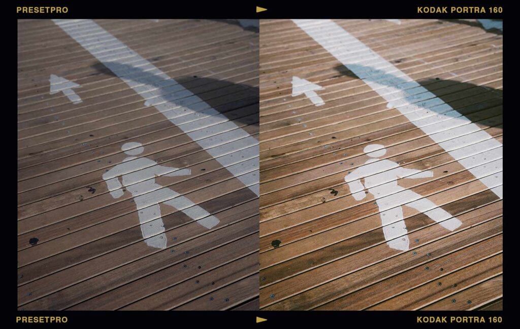
To get the Kodak Portra 160 film look in Lightroom, apply a Portra 160 inspired preset for the character, then dial the matching profile’s Amount slider until the softness sits right. The Presetpro library includes nine Portra 160 inspired preset versions with matching profiles, color checked against real film, plus an FE edition with a moody Chroma fade built in. Here’s what the quiet Portra does, and when to reach for it over its louder sibling.
Key Takeaways
| The film | Kodak’s gentlest portrait stock, the fine-grain choice for studio and bright light |
| The look | Soft contrast, the finest grain in the Portra family, clean and controlled color |
| In the library | Portra 160 inspired presets in nine versions (base, +, ++, +++, ++++, plus film, cool, warm, and boost) with matching profiles, and an FE Chroma edition |
| Best for | Studio portraits, bright daylight, editorial, fine art work where subtlety wins |
| Get it | The Film Emulation Collection or The Creative Flow |
Why Portra 160 Is the Quiet Favorite
Portra 160 was born in 1998 alongside the rest of the Portra family, originally as two films: NC for natural color and VC for vivid. In 2011 Kodak folded both into the single Portra 160 photographers shoot today, the slowest and finest-grained member of the line. Where Portra 400 became the do-everything darling of the film revival, 160 stayed the specialist: the roll you load when the light is good and you want it handled with restraint.
That restraint is the whole appeal. Lower contrast than 400, a softer palette, and grain so fine it nearly disappears. Plenty of shooters rate it at 100 just to lean into the glow. Some films shout. Portra 160 barely raises its voice, and that’s exactly the point.
What the Look Actually Does
Drop the Portra 160 inspired preset on a well-lit portrait and the first thing you notice is what doesn’t happen. Contrast doesn’t jump. Color doesn’t push. Instead, skin settles into a soft, even warmth, highlights stay silky, and the frame takes on that composed, deliberate feeling of a photograph made slowly. It’s the difference between golden hour and a north-facing window: both beautiful, one of them calm.
Can You Tell It’s Digital?
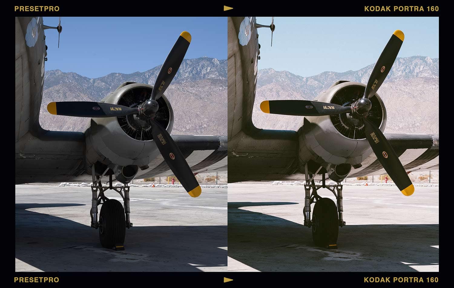
Every frame below is a digital file. The “after” is one click of the Portra 160 inspired preset; no manual grading.
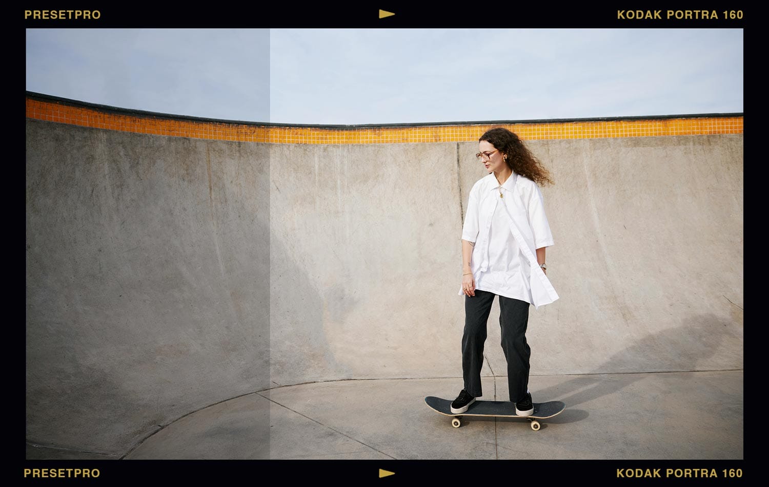
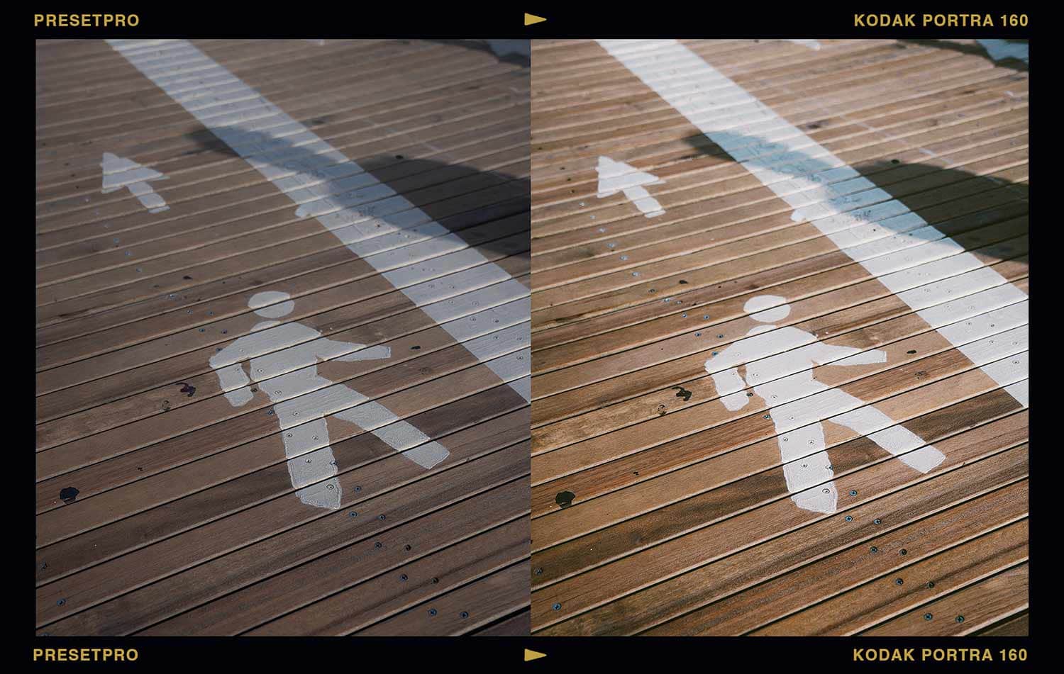
Inside the Library: Nine Versions of Quiet
The Portra 160 inspired family in the Film Emulation Collection isn’t a single preset. It’s a system.
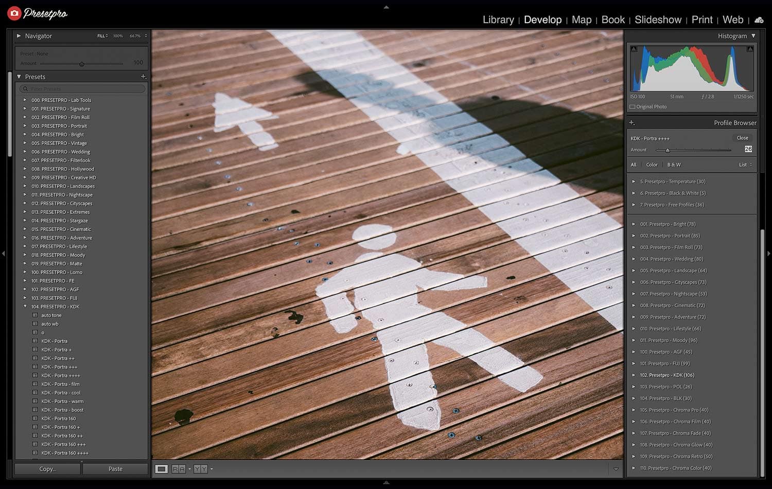
The intensity ramp. Base gives you the honest stock. The + through ++++ versions step the strength up in stages, so you pick your dose instead of wrestling sliders.
The flavors. + film adds extra analog character, + cool and + warm shift the light, + boost brings the punch, though with 160, restraint is usually the win.
The matching profile. Stack it under any version and the Amount slider fine-tunes the whole look, or run the profile alone when your image already has grain and you only want 160’s palette. One order note worth knowing: apply the preset first, then the profile. A preset always resets to its own bundled profile, so applying it after a profile choice undoes that choice.
The FE edition. The FE series version comes pre-blended with a Chroma profile, so a moody, faded film base is built in and the mood is one slider away.
Finish with Lab Tools if you want the grain dialed precisely: 160’s texture is famously fine, so keep it at a whisper or push it toward something grittier.
Try the Look Free First
The Portra Colour free Lightroom profile gives you a taste of the Portra family palette at zero cost. The free film emulation collection has more stocks to sample.
Portra 160’s Siblings
When the light drops or the day speeds up, Portra 400 is the do-everything answer, and Portra 800 takes over after sunset. Weighing Kodak warmth against Fuji’s cooler elegance? We settled it (sort of) in Kodak vs Fuji Lightroom Presets. The full library lives in the complete film stock guide.
Get Portra 160 in Your Workflow
Just want film? The Film Emulation Collection includes every Portra 160 inspired version above, plus the full six-family film library, the Chroma series, and Lab Tools.
Want everything? The Creative Flow ($139) adds all 16 style collections, 1,200+ presets and profiles, and 200 brushes on top.
Portra 160 Preset FAQ
Is there a Kodak Portra 160 preset for Lightroom?
Yes. The Presetpro library includes nine Portra 160 inspired preset versions with matching profiles, plus an FE edition with a Chroma fade built in. Every look is color checked against real film.
When should I use Portra 160 instead of Portra 400?
Reach for 160 in bright, controlled light: studio work, daylight portraits, and fine art frames where you want softer contrast and the finest grain in the Portra family. When the light gets mixed or the day moves fast, 400’s extra flexibility wins.
Should I use the Portra 160 preset or the profile?
The preset is the full recipe: color, tone, grain, character. The profile is just the palette, with an Amount slider. Use both to dial strength, applying the preset first and the profile second, or use the profile alone when your image already has grain.
Do these presets work with RAW and JPEG?
Yes. Every preset and profile works on RAW and JPEG in Lightroom, Lightroom Classic, and Adobe Camera Raw, on Mac and PC.
Are these official Kodak products?
No. These are digital emulations inspired by Kodak Portra 160 and color checked against real film. Presetpro is not affiliated with or endorsed by Kodak.
Lightroom Presets
Lightroom Presets
Lightroom Presets

Lightroom Presets
Lightroom Presets
Lightroom Presets
Lightroom Presets
Lightroom Presets
Kodak, Portra, and related film names are trademarks of their respective owners, used only to describe the classic look that inspired these presets. Presetpro is not affiliated with, endorsed by, or sponsored by any film manufacturer. Adobe and Lightroom are trademarks of Adobe Inc.