Introduction
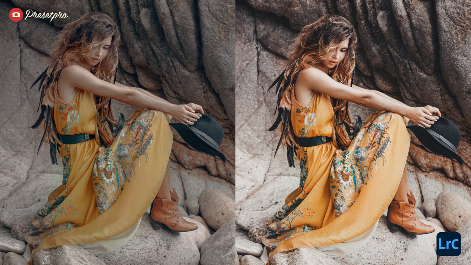
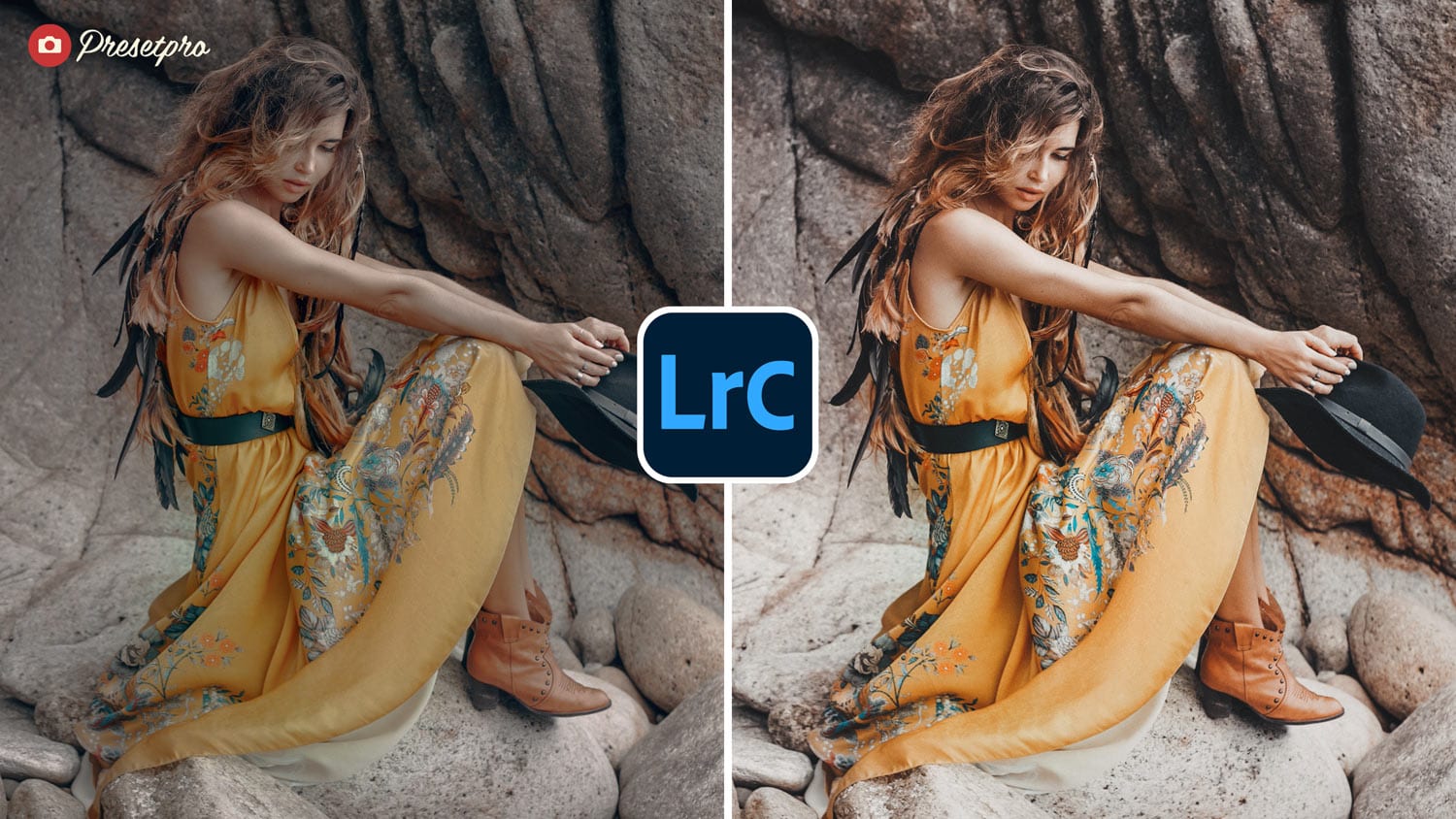
The Colour 160 – Inspired Lightroom Preset takes inspiration from Kodak Portra 160, a professional-grade color negative film loved for its smooth tones and natural look. This preset recreates Portra’s soft color palette with a film fade effect, achieved through a custom tone curve. Expect warm highlights, neutral skin tones, and a gentle vintage vibe that feels cinematic yet versatile—ideal for portraits, lifestyle, and everyday photography.
History of Kodak Portra 160
Released in the late 1990s as part of Kodak’s Portra line, Kodak Portra 160 quickly became a go-to for portrait photographers. Known for its low contrast and natural skin tones, it was especially popular in weddings, fashion, and editorial work. The film’s fine grain and accurate color reproduction made it versatile under different lighting conditions, from daylight shoots to studio setups. Today, Portra 160 remains a favorite among film shooters for its soft, timeless aesthetic.
Film Characteristics
What makes Kodak Portra 160 stand out?
- Film Type & Speed: Color negative film, ISO 160—great balance of detail and smooth tones.
- Grain Structure: Extremely fine grain, ideal for enlargements and high-resolution scans.
- Color Palette: Neutral skin tones, warm highlights, soft greens and blues.
- Contrast: Low-to-medium contrast with wide exposure latitude.
- Use Cases: Perfect for portraits, weddings, and fashion with natural rendering.
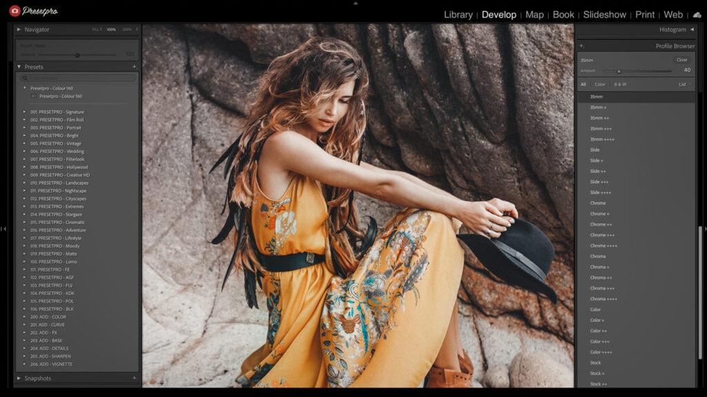
Colour 160 – Inspired Lightroom Preset
The Colour 160 preset captures the Portra aesthetic with a modern film fade. A custom tone curve gently lifts shadows for a softer look while keeping highlights smooth. Colors lean toward Portra’s natural palette—neutral skin tones, warm whites, and cool greens. The preset also introduces subtle grain to add texture and depth, giving digital images the tactile quality of film. Here’s what you’ll notice:
- Film Fade Curve: Adds a lifted shadow fade for a timeless film feel.
- Natural Skin Tones: Soft, flattering rendering ideal for portraits.
- Fine Grain Look: Adds subtle texture without overwhelming detail.
- Soft Contrast: Perfect balance of depth and delicacy in light handling.

Conclusion
The Colour 160 – Inspired Lightroom Preset delivers the elegance of Kodak Portra 160 with a touch of vintage fade. Whether you’re editing portraits, lifestyle moments, or creative projects, this preset gives your photos a film-inspired look that’s both classic and contemporary.
Key Takeaways
Feature
Details
Film Type & Speed
Color negative, ISO 160 – balanced and versatile
Sharpness & Grain
Extremely fine grain; smooth texture with detail
Color Reproduction
Neutral skin tones, warm whites, soft greens and blues
Best For
Portraits, weddings, lifestyle, and fashion
Flexibility
Great in both daylight and controlled studio setups
FAQs
Q: What makes the Colour 160 preset different?
A: It emulates Kodak Portra 160’s natural tones with a built-in fade curve for a film-inspired aesthetic.
Q: Is it good for portraits?
A: Yes, Portra is famous for flattering skin tones, and this preset keeps them soft and natural.
Q: Does it work with JPEGs as well as RAW?
A: Absolutely. RAW is best, but JPEGs also benefit from the preset’s fade and color balance.
Q: Can I adjust the fade strength?
A: Yes, tweak the tone curve or global contrast to dial the fade up or down.
Q: Is this part of a larger collection?
A: Yes, it pairs well with the Complete Lightroom Collection, featuring more film-inspired looks.
Q: Where can I download the free preset?
A: Download the Colour 160 preset here: FreePresets.com
Lightroom Presets

Lightroom Presets
Lightroom Presets
Lightroom Presets
Lightroom Presets
Lightroom Presets
Lightroom Presets
Lightroom Presets