

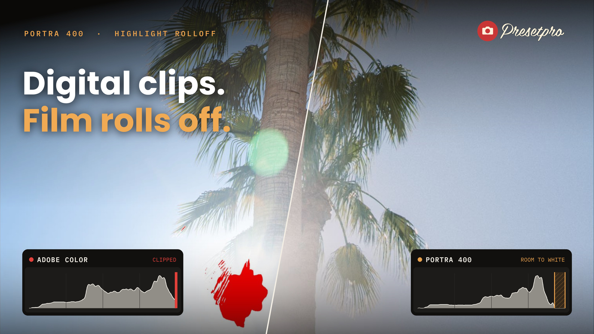
Blown highlights are the fastest way to spot a digital file. The sky behind a backlit palm, the chrome on a car, a streetlight at night: on a RAW file they slam into pure white and go flat. A scan of a film negative almost never does that. Its brightest tones land just short of white and roll off softly, and that one difference does a lot of the work when a photo reads as film.
This article shows what is going on in the histogram, why the Highlights slider cannot fix it, and how the Portra 400 profiles in The Creative Flow build a film scan’s highlight rolloff into the profile itself. Press play for the video version.

Why digital highlights look digital
A camera sensor records light up to a hard limit. Past that point every pixel gets the same maximum value, and Lightroom shows it as pure white. Open the histogram on a photo with a bright sky or the sun in frame and you will see it: a stack of pixels pressed against the right edge. In the photo those areas read as flat patches with a sharp border where the detail stops.
What film does instead
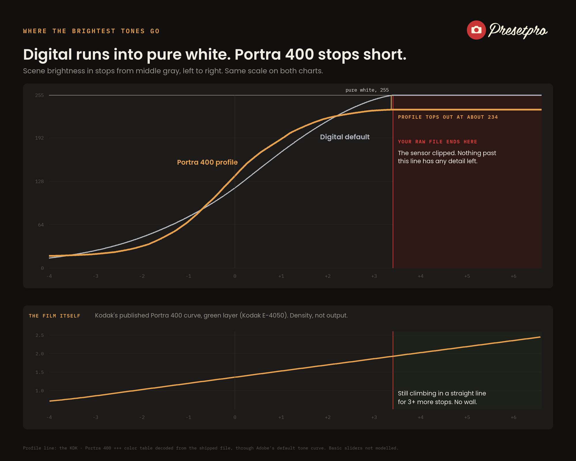
Color negative film is famous for its highlight latitude. It keeps separating tones well past the point where a sensor runs out, so the bright end of the frame is a gradual slope rather than a wall. When that negative is scanned, the lab sets the white point a little below pure white and the black point a little above pure black. The result is the look you know from a good film scan: highlights that ease into a soft off-white, and shadows that never fully crush.
Why the Highlights slider is not enough
The obvious move is to pull Highlights and Whites down. That reshapes the top of the tonal range, but it does not set a ceiling. A pixel the sensor clipped still renders as pure white, so the histogram still touches the edge and the sky still has that digital patch in it. To get a film scan’s white you need a ceiling, and in Lightroom the place a ceiling holds is inside the profile.
How the Portra 400 profiles do it
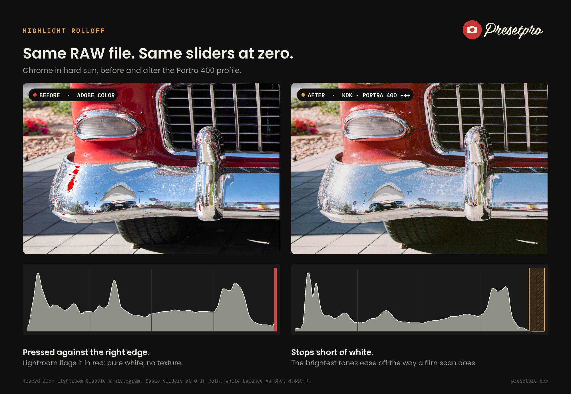
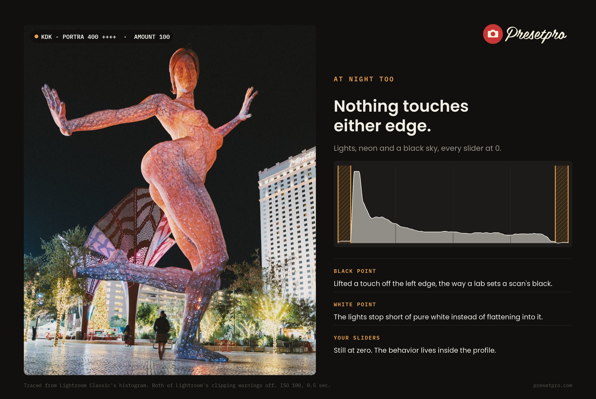
Every one of the nine Portra 400 profiles in The Creative Flow, inspired by Kodak Portra 400, carries the scan’s behavior inside its color table. With your sliders at zero, the brightest output each one can produce lands around 234 to 236 out of 255, not 255, and the tones above roughly a stop over middle gray are eased into that ceiling rather than cut off at it. The blacks sit a few steps above zero, the way a lab scan sets its black point. Because all of it lives in the profile, it happens on the first click and every slider in the Basic panel is still yours.


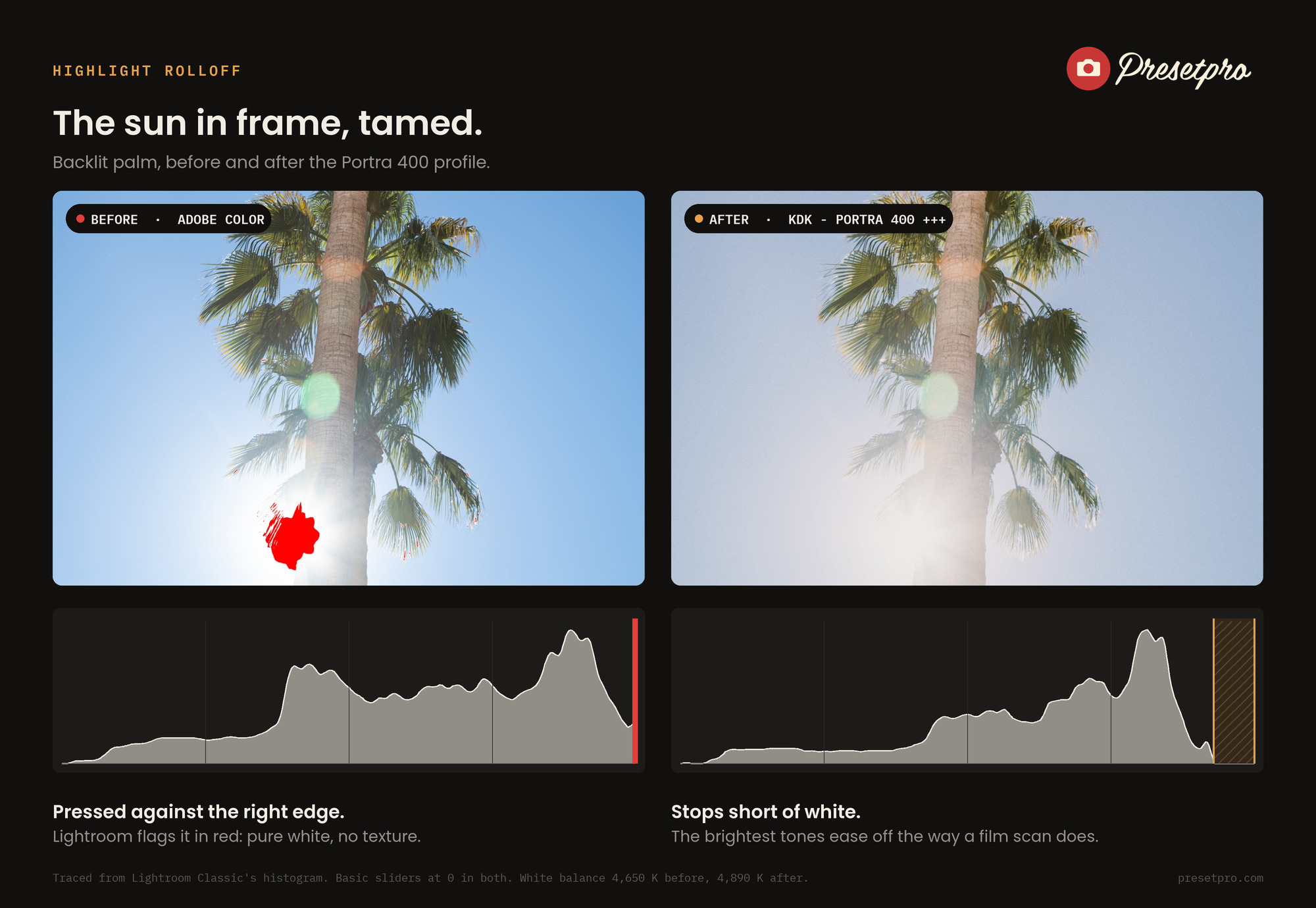
Here is what that looks like on three RAW files. Watch the right edge of the histogram in each pair.

What it will not do
A profile cannot recover detail the sensor never recorded. If the sun or a window clipped, that information is gone, and nothing in Lightroom brings it back. What the profile changes is how the clipped area reads: a soft off-white that the tones below ease into, instead of a hard white with an edge. For the best result, still expose so the important highlights hold detail, then let the profile handle the roll off. And if you push Exposure or Whites hard after applying it, you can reach pure white again, so keep an eye on the histogram as you finish.
How to use it
1. Open the Profile Browser and click any of the KDK - Portra 400 profiles. Nine strengths ship with the stock, from soft to strong, plus cool, warm, film and boost variations.
2. Leave Amount at 100 to judge the look. That is the strength the profiles are designed at. Lower it to soften the effect.
3. Finish with your own sliders. If you also use one of the matching presets for its fine grain, apply the preset first and the profile second, because a preset loads its own bundled profile.
The same highlight treatment is built into other film profiles in the collection too, including Portra 160, Portra 800, Gold 200 and Superia 400. For the bigger picture of how the film looks compare, see the film emulation guide, and for a tour of everything in the download, inside The Creative Flow.
Quick answers
Can a Lightroom profile recover blown highlights?
No. If the sensor clipped, that detail is gone, and no profile or slider can bring it back. What a profile with a built-in highlight ceiling changes is how the clipped area looks: a soft off-white with the tones below easing into it, instead of a hard digital white with a sharp edge.
Why does the Highlights slider not give me a film look?
The Highlights and Whites sliders reshape the top of the tonal range, but they do not set a ceiling. A pixel the sensor clipped still renders as pure white, so the histogram still touches the right edge. The Portra 400 profiles carry the ceiling inside the profile itself.
What Amount should I use on the Portra 400 profiles?
Start at 100, the strength the profiles are designed at. Lower it to soften the look. Above 100 the look gets stronger and the highlights get pushed down further, so judge the rolloff at 100 first.
Do I need a preset as well as the profile?
No. The profile alone gives you the color and the highlight rolloff. The matching presets add a fine grain mask on top. If you use both, apply the preset first and the profile second, because a preset loads its own bundled profile.
Want this on your own RAW files? The Portra 400 profiles are part of The Creative Flow, a core of 1,200 presets and 1,200 profiles in 36 collections for Lightroom Classic and Camera Raw. SAVE30 is applied for you at checkout from that link.
Kodak and Portra are trademarks of Eastman Kodak Company. Presetpro is not affiliated with or endorsed by Kodak. Adobe and Adobe Lightroom are trademarks of Adobe Inc.